Helvetica
Helvetica is one of my favourite fonts. I have used it several times in my projects both outside and in University, mainly because it looks timeless. It never ages and I think can be used for a range of designs and still look modern.
Geo-sans light
I really like this font for its simple line layout, and its very light appearance, hence the name. It has an almost elegant look to it, which I think would suit a lot of modern designs. Although I haven’t used it yet in my work, it is always I font I consider when creating something that needs typography.
I really like this font for its simple line layout, and its very light appearance, hence the name. It has an almost elegant look to it, which I think would suit a lot of modern designs. Although I haven’t used it yet in my work, it is always I font I consider when creating something that needs typography.
Giorgio Sans
This font to me looks very up-market with its clean layout and design. I think it would fit great in a fashion-based layout, possibly a magazine or even as part of a fashion label logo. It is a very elegant font, as well as being slim and tall.
Memoriam
I only recently found this font, but the contrast of the thin lines with the thick strokes really caught my eye. To me it is both elegant and bold, which i think is a great contrast to have in a font, although I would find it hard to use with it having such a unique look to it.
I only recently found this font, but the contrast of the thin lines with the thick strokes really caught my eye. To me it is both elegant and bold, which i think is a great contrast to have in a font, although I would find it hard to use with it having such a unique look to it.
Biographer
This font caught my eye because I thought it flowed very well throughout the type, and had a very fluid, elegant look to it. It almost has a slight gothic feel to it, which I personally like. It does however look quite old fashioned.
This font caught my eye because I thought it flowed very well throughout the type, and had a very fluid, elegant look to it. It almost has a slight gothic feel to it, which I personally like. It does however look quite old fashioned.
Rockwell
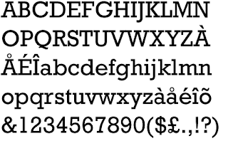
I came across this font when I first created a business card, as a friend suggested it to me. I thought it really suited a smaller case, and worked very well and I tend to use it on most business cards that I produce now. I think I like it because of the slim lines and how modern it looks.
Americana
VTC nue tattoo script
I’ve always liked tattoo style calligraphy ever since watching Miami ink and LA ink. This is the closest font I have found that replicates Kat Von D’s style of calligraphy, and I really like it, considering I don’t like too many calligraphy fonts. It is a very old school style font, but I think thanks to tattoo’s become more and more popular, it does look quite modern now.
I have used this font in a few of my projects, most recently my Bistro project. It is a simple serif font but I think it works quite well and looks modern if used correctly. It is probably my favorite serif font I have come across as the spacing is pretty much spot on between the letters, so not much work has been needed on it most of the time I have used it.
Eurostile
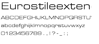
This is a very modern looking font I think, although I only really like it in its normal state, as I think it looks quite high fashion and would suit a fashion ad or something along those lines. I think I have seen this font used quite a lot for headlines in books, which is probably why I recognize it.
Reboard
I first used this font in my final project of my national diploma course. I really like the look of the filled in letters and the striking appearance of the font overall. Some of the letters are a bit close together however, especially the ‘q’ and ‘r’, but overall I think this is one of my favourite fonts for how unique it looks.


No comments:
Post a Comment