I have just recently completed a 3 week placement at Jules B fashion house, this being my first ever placement. It was a brilliant experience and i learnt a lot during my time there. I was set up working with Peter, the graphic designer for Jules B, and Nina, who ran online marketing. Being my first placement, i was extremely nervous on my first day but felt that i settled well after a few days.
Throughout my time at Jules B, i completed several tasks ranging from website banners, emailer banners, button designs for the companies website, as well as some photo editing.
During my first week, i was asked to create google banners for all the brand categories listed in the autumn/winter 2011 range. These categories were all on the jules b website, so it was important to make them stand out to attract internet users to the website to look at the products. I was given a file to use which contained beautiful photography from top range brands including Barbour, Armani jeans, Hackett and Paul Smith. The space on the banners was limited with them being so small, so i had to make sure i cropped the photography to fit well with each template size. I had a bit of problem with resizing the images, as at first i resized them too much which reduced the quality greatly, giving me a pixelated result, but after i learnt from my mistakes i managed to get through all the google banners, then resize them under 50kb so they could be eventually uploaded to the internet.
Here are some examples of the banners:
As you can see the photography i was able to work with was stunning and a joy to use!
Following the completion of the banners, i was asked by Nina to work on some emailers. These emailers were used in emails sent to customers on the mailing list or those who have used the site before, to advertise a incentive to the customer, with the buttons included in the email, linking them to the section of the site and giving them a code to enter for discount. I found this task quite difficult as i had to arrange the items of clothing so that they complimented each other. Also, i could only resized the images once so i had to make sure i stuck to a template to save the quality of each image.
Here are some of the emailers i created throughout my second week:
I stuck to a similar layout throughout each emailers, making them all match nicely.
During my second week, Julian (the owner of jules b), asked for some visual examples of a colour changes to the logo on one of the clothing stores. I had to use pantone colour looks to match up the colours in illustrator, then edit the logo onto the front of the shop and make it look realistic. In the end, Julian chose the following three examples to consider:
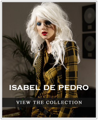
During my final week, i was asked to work on some brand buttons to use on emailers. Again, i got to use some lovely photography during this task. The buttons were to advertise each brand collection and would be sent out in emails or used on the website. I think, even though the final designers were quite simple, they were one of my favourite tasks to work on!
Here are some examples:
Finally, during my last days i was asked to make some category banners to go on the actual website for some new collections. For this, i had to cut out some stock photography of models as cleanly as possible, then place them on a banner and air brush in the shadow. I found the shadow the hardest part, as i had never created a shadow that way before, but i felt i got the hang of it eventually and they turned out
good.
and here they are in use on the site!
Overall, my time at Jules b was extremely valuable, i learnt what it is like to work in a company and needing to keep to deadlines and produce quality work at a quick pace. I also learnt quite a few techniques on photoshop which will i will be using when creating my own work.
Finally, a big thank you to the Jules B team for all the help throughout my placement, and making my 3 weeks there brilliant!