
Monday 20 February 2012
Personal T shirt
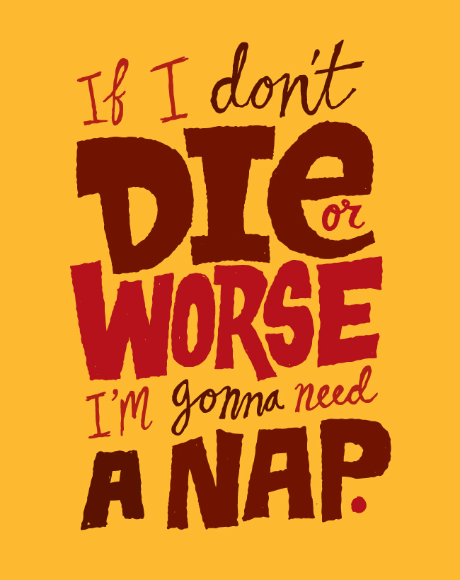
I recently had some spare time in which i got to work on a T-shirt design that i had in my head for a while. The design was based on a Radiohead song, but i changed the lyrics to make it a bit different. I also added a distressed texture to the text which i thought brought the whole design to life. I was really pleased with the way it turned out, and would love to do more next time i have a spare moment!

Some Lovely Posters
Since i spend most of my waking hours doing posters for different people, i always come across thousands of designs that i look at for inspiration. This one set of posters really caught my eye however. I love the white line illustration, i think it fits really well with the photography. It looks very elegant and the drawings are really detailed, making the posting stand out and look very unique. I'd love to try something like this with my posters, i wish i had more time to spend on them but hopefully i will soon and can try something more illustrative!


I also really like the hand drawn typography, it is simple yet very beautiful.
Pat Perry - new website
While looking through inspiration for my own personal website, i came across one of my favourite artists, Pat Perry. I hadn't looked at his website in a while and was surprised to see that he had completely changed it, with a brand new layout and lots of new examples of updated work. He also put his blog which i follow and put it on the website instead of having an external link.

I really like the clean look of his website, using white seems to make the work stand out more. This is something i could consider for my own website when i come to creating it!

I really like the clean look of his website, using white seems to make the work stand out more. This is something i could consider for my own website when i come to creating it!
Sunday 12 February 2012
Chris Piascik
While browsing through Behance network, i came across a typography/illustration artist called Chris Piascik. I was really inspired by his portfolio, as it appealed to my style that i am aiming for, and he had a broad range of work from t shirt designs, to printed book work. I even ended up buying one of his books that he designed around bikes called 'I love my bike'.
One of the most inspiring parts of his website was his 'daily drawings' page. I found it incredible that he has the time to fit in 5 new personal drawing every week to keep his mind fresh all the time.
Here are some examples of his work that i really liked, but it was hard to choose from!


One of the most inspiring parts of his website was his 'daily drawings' page. I found it incredible that he has the time to fit in 5 new personal drawing every week to keep his mind fresh all the time.
Here are some examples of his work that i really liked, but it was hard to choose from!

I have bookmarked Chris's website, so i'm sure i will be looking back at his work for inspiration in the future!
Little White Lies - Negotiated project
For my negotiated project, i decided to take on the 'Little White Lies' brief in designing an illustrative front cover for their magazine. The brief instantly appealed to me because of my love for illustration, and consider the magazine focused on another love of mine, films, i didn't hesitate to choose this brief.
Looking at the brief, there was a list of films that were on offer for the front cover, one of which was one of my favourite films of 2011, Super 8. The brief stated that the cover had to be focused on the main character of the film, so i had to consider this when creating my illustration.

Looking at the brief, there was a list of films that were on offer for the front cover, one of which was one of my favourite films of 2011, Super 8. The brief stated that the cover had to be focused on the main character of the film, so i had to consider this when creating my illustration.

I was quite pleased with the outcome of my project. I really struggled to choose a style that i thought was unique enough and hadn't already been done for previous covers of the magazine. I was really inspired by David Fullerton's paper texture illustrations, which eventually became the main inspiration for my cover. I was pleased with the way the hand drawn type turned out , and i felt it sat well with the illustration style. I feel as thought my illustration skills have somewhat improved from this project, although it was quite a simple outcome, i felt that it worked well. I will be submitting this to D&AD so hopefully i'll get somewhere with it!
Subscribe to:
Posts (Atom)